YouTube Ads Prototyping Tool
An internal tool for prototyping new YouTube ad formats. Built and shipped production features, and designed its next generation for non-engineers and broader adoption.
Note: These screens are my own redesigns. Copy, labels, and advanced settings were rewritten or invented to protect Google's confidential information — some deliberately unrelated to the real tool.
The problem
Even small changes to prototypes for research studies required engineering hours.
Testing a new YouTube ad format starts with a working prototype, something a research participant can actually click, scroll, and react to. The Ads UX Engineering team had built an internal prototyping tool for this, but it was mostly a UI wrapper over required knowledge of HTML/CSS/JS, so in practice only our own team used it.
This meant that every new ad format — even a small tweak to an existing one — required engineering hours to prototype. The team wanted to make the tool self-serve, so UX designers and researchers could build their own prototypes without needing an engineer on call.
I worked on this tool from both sides. As a UX engineer on the team, I built and shipped production features on the live tool in Lit and TypeScript and used it to deliver prototypes for real research studies.
In parallel, I investigated its next generation: the version UX designers and researchers could pick up without us. I left Google before the redesign shipped, so this case study covers both the production work that shipped and the design work I handed off.
Research
UX designers and researchers weren't just untrained on the tool — they were unconvinced.
Two methods, running in parallel. I built with the existing tool daily — prototypes of YouTube Shorts ad formats for live research studies — which showed me where it was slow. And I interviewed four of its intended users, two UX researchers and two UX designers, which showed me why none of them were asking for it.
Two things came back. Most of them didn't know a self-serve version was planned at all. More importantly, they weren't convinced it would be a quality-of-life upgrade. The status quo worked: they had UX engineers to build prototypes for them, so learning a new tool was a cost with no obvious payoff.
That reframed the bar for the redesign: it couldn't just be possible for non-engineers to use — it had to be easier than asking us. This meant we couldn't expect non-engineers to write code and handle the hard cases, but we could expect them to do the parts that were easier to do than to wait for someone else to do them.
That finding is why the redesign leans so heavily on templates and components. The parts a designer would plausibly do unaided are the parts where the building blocks already exist.
Assemble the prototype
- Start from templates
- Assemble screens and variants
- Set element options
- Run the studies
Build what it's assembled from
- Build custom elements
- Author new templates
- Grow the shared library
- Keep a code hatch for edge cases
Templates,
components
Edge cases,
custom work
The first version
I rebuilt Figma's blank canvas, and nobody knew where to start.
My first iteration took the Figma comparison literally: frames, text, and an empty board to put them on. Putting it in front of people went badly in a way I hadn't planned for. They didn't get stuck on which control did what. They got stuck before that, on what they were supposed to be making.
The reason took me longer to see than it should have. Almost nobody in Ads designs an ad in isolation. They design a small change inside something much larger that already exists — a Shorts feed mid-scroll, a video page, a player that's already running. An empty board asks you to build all of that context yourself before you can touch the one part you actually came to change.
I had designed for the concept of a prototype instead of for the work. That's the mistake this project turned on, and everything below is the correction.
The two findings stack. Research said designers needed a reason to switch tools. The first version said they also needed somewhere to switch to — a starting point that already contains the thing they're changing. Templates and components answer both at once.
Design principles
So I chose a division of labor over full self-serve: designers and researchers assemble, engineers build what they assemble from.
That choice has a price, and it lands on my own team. Full self-serve would have been cheaper to staff and impossible to adopt. A division of labor buys adoption by committing UX engineering to permanent work: building rich components in code, authoring and maintaining a template library, and staying on call for the tail cases. We trade one-off prototype requests for a library we own indefinitely.
What I turned down
Leaning the tool on AI prompting instead of a component library — describe the ad format, get a prototype back. The internal models available to us then couldn't produce anything close to YouTube fidelity, and betting adoption on a capability we didn't have would have repeated the mistake we were fixing. We designed AI affordances in as additions to the library, not as the foundation under it.
The redesign came down to a few commitments:
- Start from YouTube templates and components, not empty boxes: nobody in Ads needs to begin from scratch — it's always an iteration
- Rich components with smart options: UX engineers build components that are flexible and powerful, and the tool surfaces these options without requiring code
- Reveal complexity progressively, and group functionality: hide advanced settings until they're asked for, so screens read as a handful of decisions, not a wall of settings
- Borrow Figma's interaction grammar: designers should feel like they already know the tool — clear imagery, icons, and tooltips over assumed knowledge
The redesign
A first-time user's first fifteen minutes had to end in a working prototype.
- A visual overhaul, to make the tool feel modern and worth choosing
- Clear groupings of functionality and settings, to reduce cognitive load
- Bold, obvious interactions modeled on tools designers already use
My benchmark flow was a first-time user's first fifteen minutes: they would start with a template, add pre-made YouTube components to a board, wire up simple interactions, and then be able to export a working prototype. This path should feel intuitive and effortless. Advanced usage through custom components, variables, conditional logic, etc. would stay available, but never in the way.
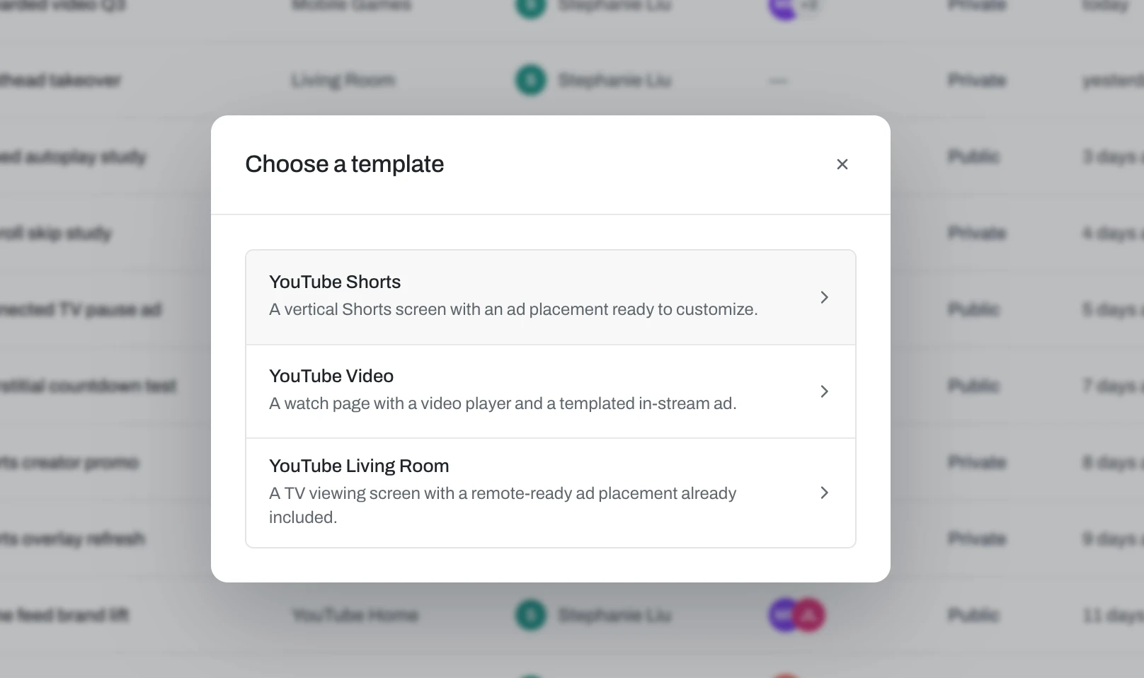
Pass one — start from a template
Templates make starting from scratch more approachable, and empower the user to start creating. A new user with no projects is guided straight into one.
Pass two — assemble from components
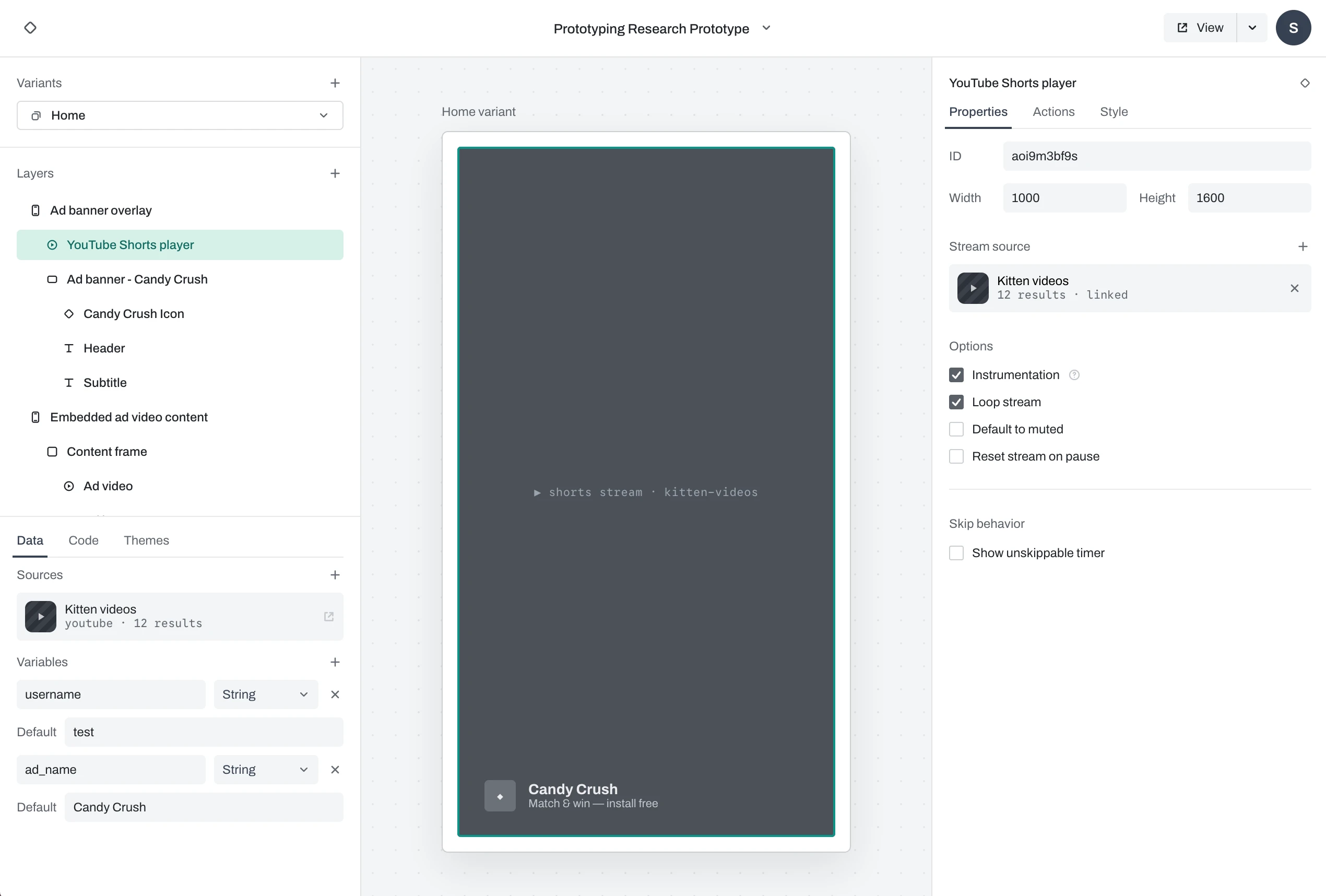
Sections are borrowed from known tools like Figma, so users can reason about the interface without learning a new interaction grammar. Layers and variants (for experiments) on the left, data that applies to the entire project on the bottom left, and properties and options that apply to only the selected element on the right.
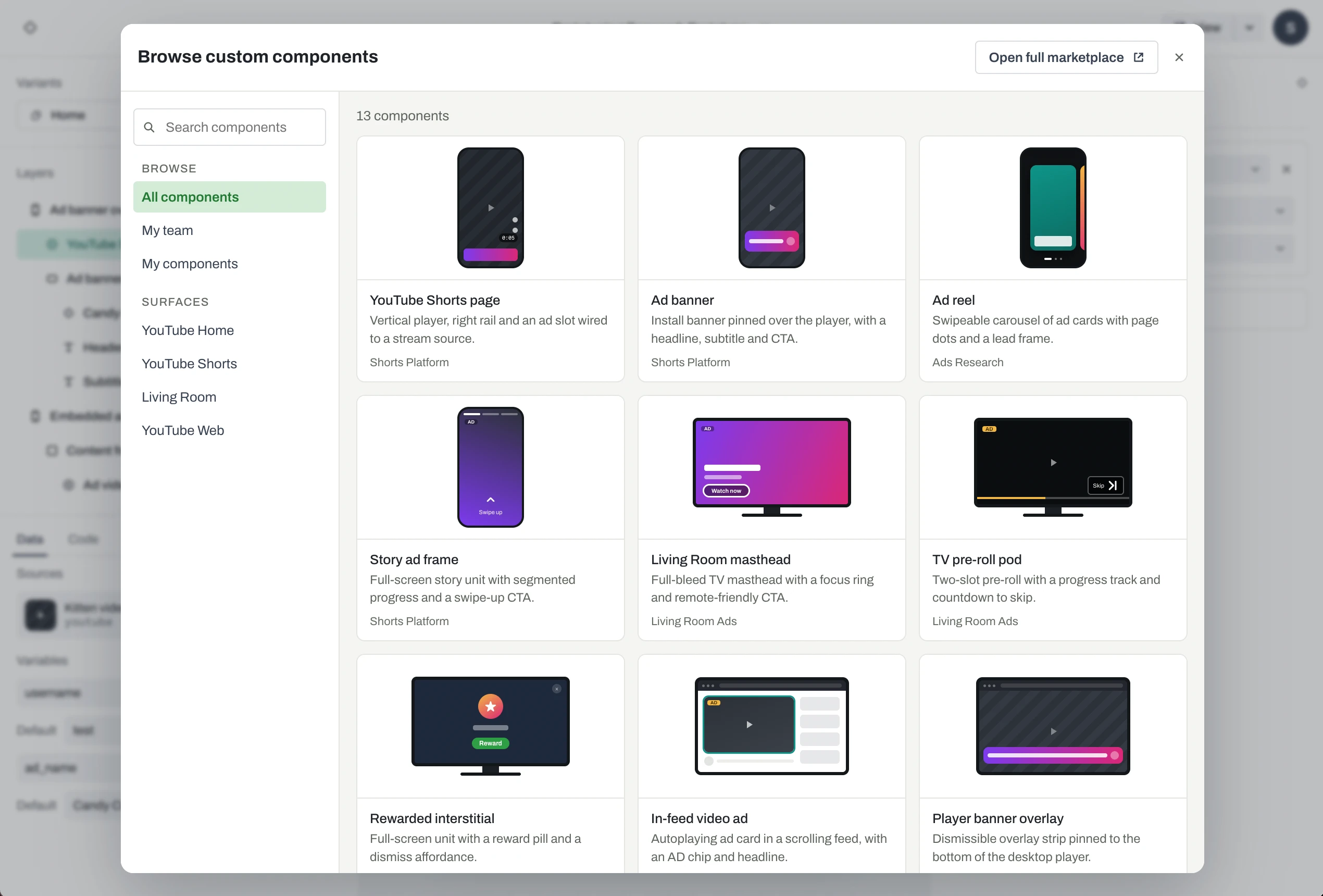
A long list of custom components is searchable across teams, so users can build with building blocks provided by UX engineers without needing to know how to code.
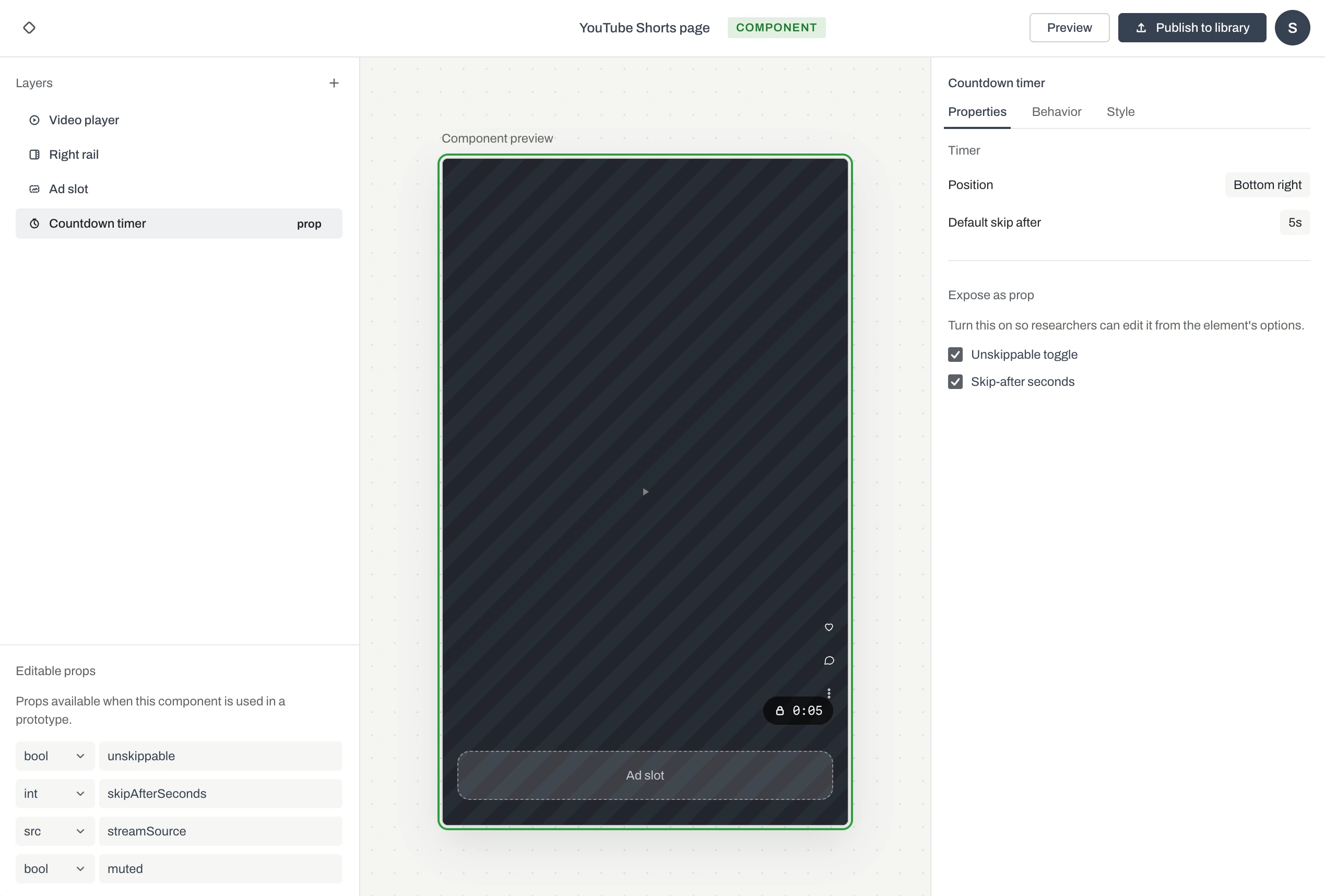
The components editing screen is visually distinct from the prototyping editing screen, but keeps the same conventions. Users are encouraged to create their own components for reuse.
Pass three — advanced, without the cliff
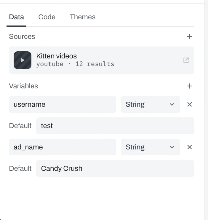
Data, code, and themes are unique to this tool. They allow the user to have a lot of fine-tuned control over the prototype, and may require a UX engineer for tail-end use cases. But the redesign surfaces the most common options first, and hides advanced settings until they're needed.
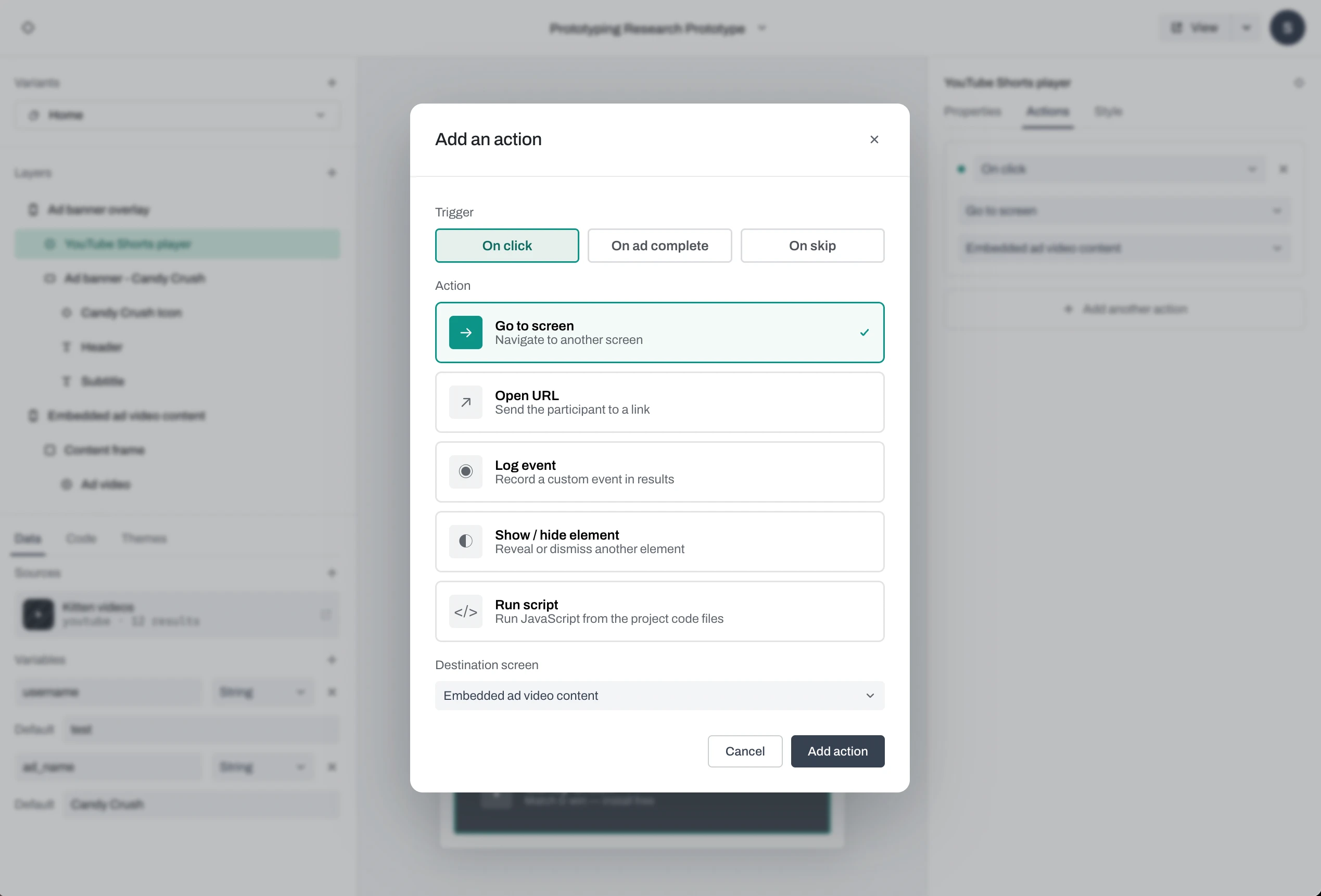
Actions allow for interactivity without writing code, but the option to trigger scripts is still available for advanced users and custom interactions.
What shipped, what didn't
The production work shipped. The redesign didn't.
I left Google in October 2025, before the redesign shipped. The production features I built along the way are part of the live tool.
- Built functioning prototypes of YouTube Shorts ad formats used in live user research studies.
- Designed and shipped new production functionality in the tool itself.
What the work established
- A sharper problem definition. The goal isn't to remove engineers from the loop — it's to move us to the highest-leverage part of it. Researchers and designers own the assembly; engineers grow the library underneath them.
- A tested design direction. Components-first authoring, progressive disclosure, and a Figma-native interaction grammar, validated against the exact moments where real users stalled.
- The case for the audience. The research documented why designers and researchers weren't converting, giving the team a target for the next version rather than a hunch.
Takeaways
The editor was never the hard part. The library underneath it was.
Designing a tool while maintaining its production codebase is my favorite way to work — the design and the implementation inform each other in both directions.
In this project, the interesting problem isn't really the editor, but rather the structure underneath it. Questions about what lives in the library, who builds it, and how much a non-engineer can do before they need help.
A year on, the AI tooling that wasn't ready is ready, and much of this prototyping can be done by prompt. That changes who assembles a prototype. It doesn't change the question underneath: what belongs in the shared library, who owns it, and where a non-engineer still needs an engineer. Whoever builds this next has the same structural problem with a faster front end.
What I'd do differently
Build the library first, inside the tool that already existed. The research said the blocker was incentive, not interface. If that's true, ten strong templates and a searchable component library would have converted a designer without any redesign at all, and would have left something shipped behind.
The cost would have been real. The tool stays visually dated, which was part of why it wasn't worth choosing, and the deliverable becomes a library instead of an editor — less to show, and harder to argue for.